Case Study 3: Leave of Absence Portal, The Jellyvision Lab, Inc.
Building a Product From Scratch, and Growing It Into a Business
Due to confidentiality agreements with past clients and employers, some details, visuals, and data have been generalized or recreated.
-
Sole designer on MVP → Experience lead → Team builder as product scaled
-
3 years, MVP through multi-client platform
-
1 → 11 enterprise clients
100% multi-year contracts with meaningful ACV
93% workforce reach at flagship client
The opportunity:
Employee leave requests surged after the pandemic. HR teams weren't growing fast enough to absorb the volume. And employees navigating a medical event, a new baby, or a family crisis were being left to figure it out alone.
When Jellyvision sunset its legacy LOA tool due to an outdated tech stack, I pitched a refreshed concept as the sole designer on the Custom Solutions team to build something better from the ground up, starting with one pilot client and one engineer.
Starting from scratch:
Leading discovery with our pilot client, a nationwide financial services company with 16,500 employees, I defined the information architecture, designed the UI, and worked through the logic challenges with engineering. The MVP launched on time. The results were immediate:
15,425 unique users; 93% of the client's entire workforce
25% completion rate, nearly double the 15% industry average
The client renewed. Then told their peers.
Modeling the Decision System:
The hardest design problem was the eligibility flow, a branching conversation that had to route employees correctly based on leave type, employment status, hours worked, tenure, state of residence, and reason for leave, while still feeling like a supportive conversation rather than a bureaucratic form.
I mapped the full decision logic in a structured document that served as the single source of truth for both design and engineering, capturing every question, possible answer, conditional path, and resulting action.
To support reliable decision making at scale, I first modeled the experience as a structured operational system rather than a linear flow. Each user input triggered eligibility checks, policy rules, and state transitions that determined the next available actions.
This approach allowed engineering to implement the system as a deterministic decision model while ensuring users experienced a clear, guided interaction rather than navigating raw policy logic. Over time as complexity increased, we explored linear models while delivering to the client in a narrative, digestible way.
Scaling up
What started as one custom build became a consistent revenue stream. As we grew, I redesigned the system to use a modular architecture that allowed faster builds and easier customization.
We added a lighter federal-only version for smaller budgets, white-label and co-branded options to reduce vendor fatigue, and state-specific law overlays (right/below) as client complexity grew.
As volume increased alongside our other projects, I transitioned from sole designer to team lead, hiring and mentoring additional contractors as needed, and establishing the Figma component library and delivery workflows that kept quality consistent across simultaneous engagements.
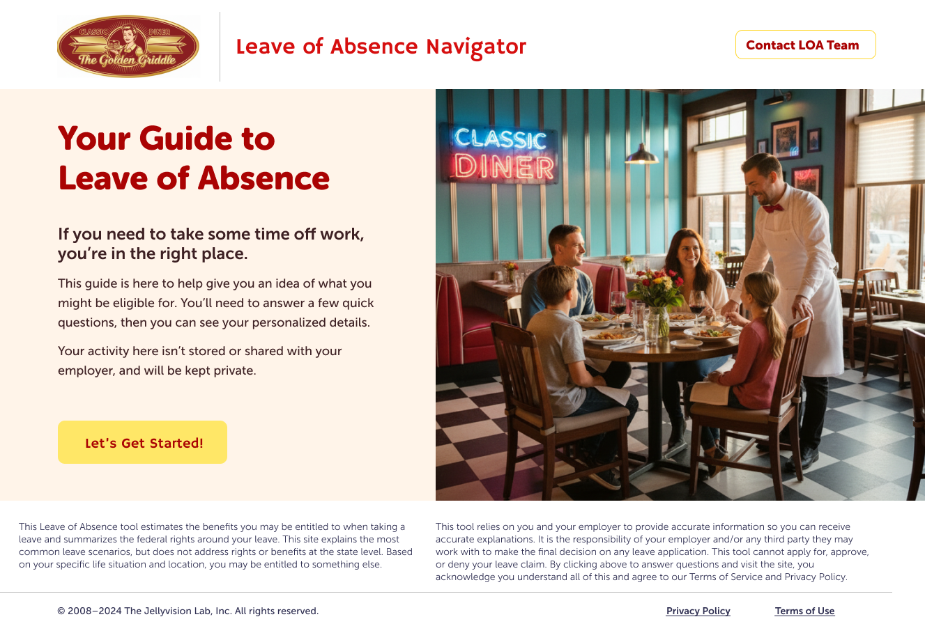
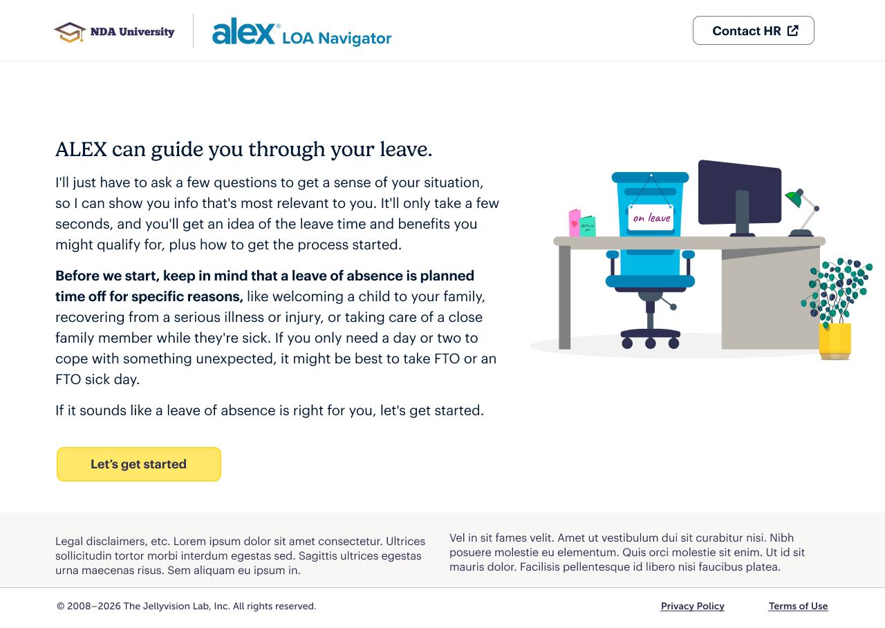
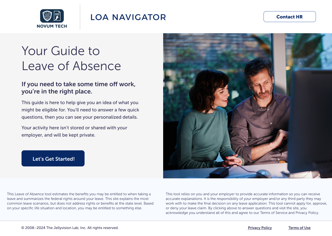
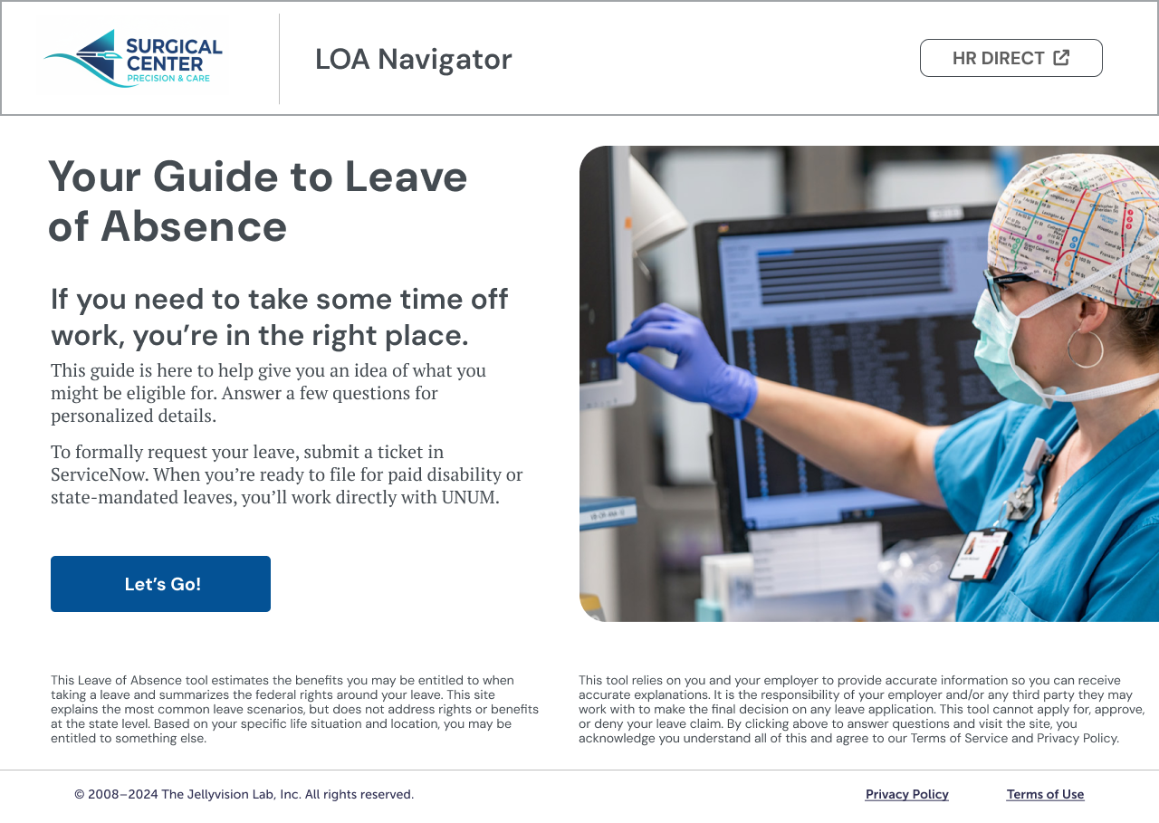
Modular site design allowed flexibility around styling, logic, and industry
We launched the MVP on time and on budget.
Results were immediate:
-
15,425 unique users
93% of the client's entire workforce visited the portal in the measurement period
-
25% Completion rate
Nearly double the 15% industry average for unenforced completion or training.
-
12 Multi-year Contracts
We landed 1+ new enterprise client per quarter from launch, with 3-year average contract length.